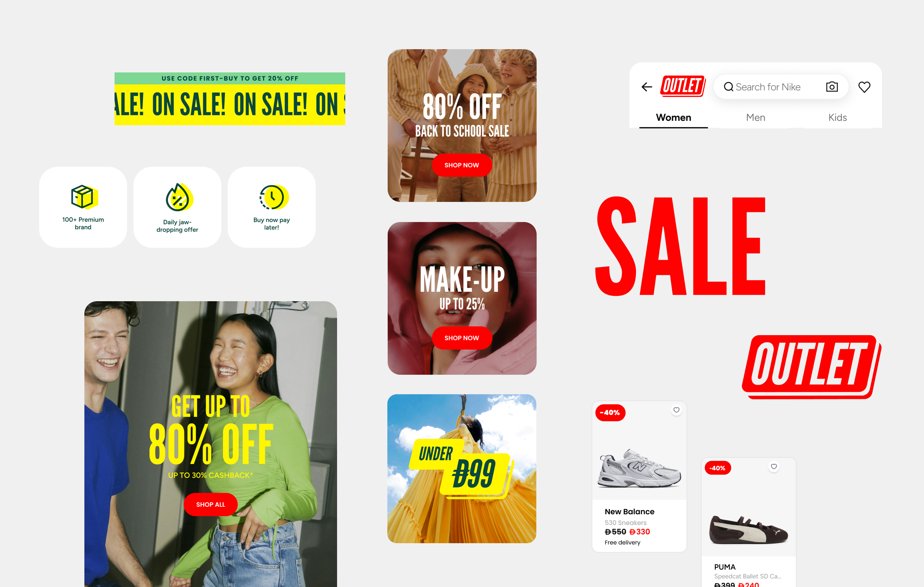
A new chapter: the outlet edition


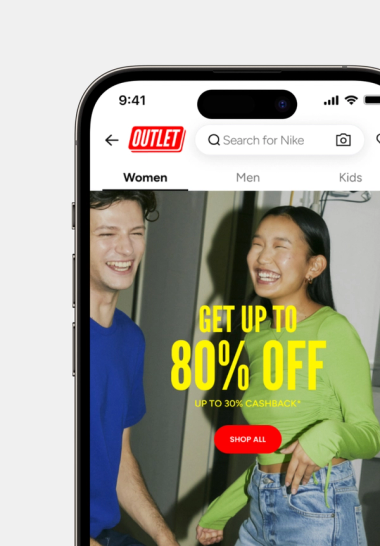
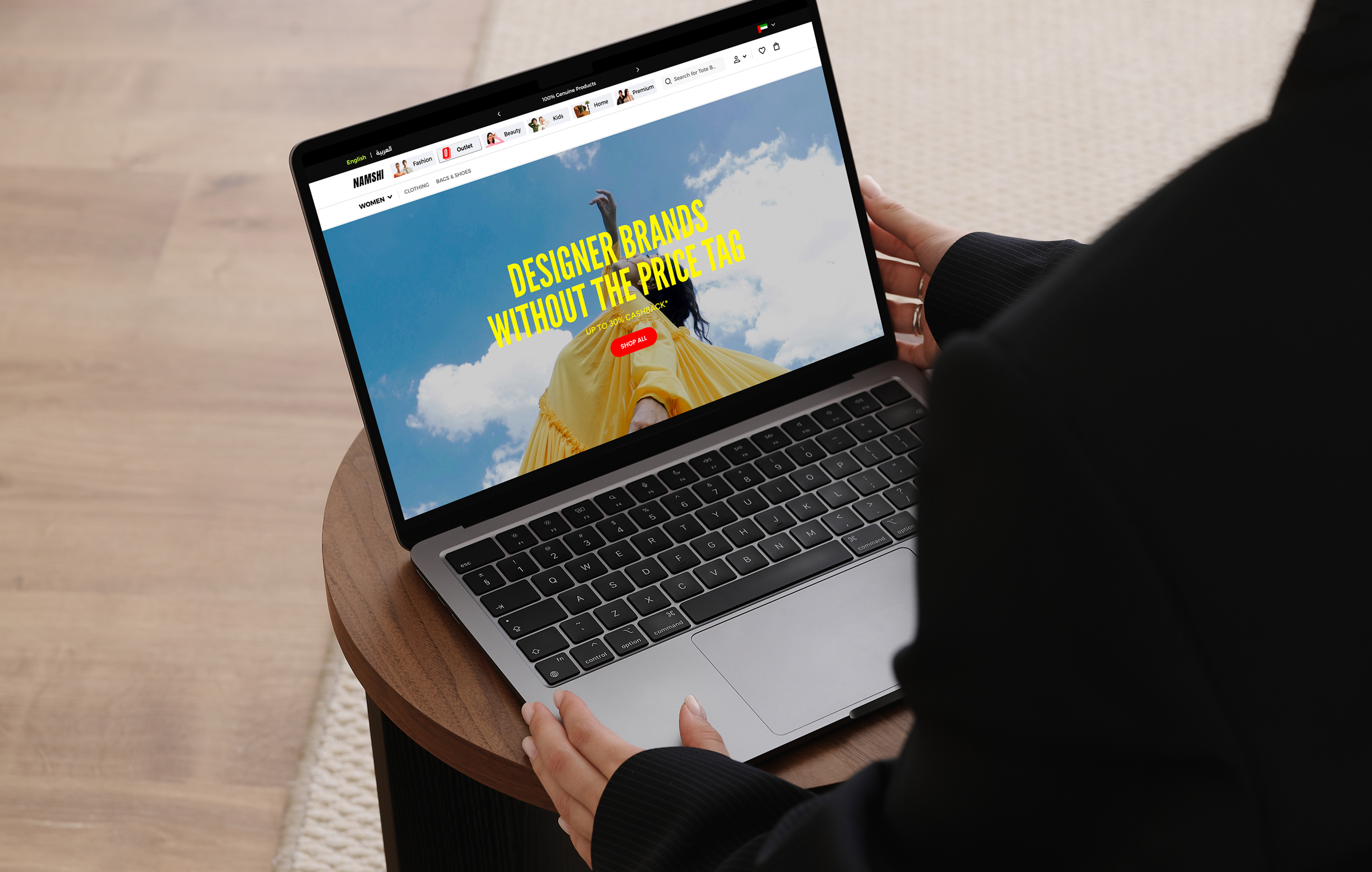
Creating a new sub-brand for Namshi: Namshi Outlet
Strong, legible typography for clarity and confidence

A bold mark that captures attention and signals affordability
The colors are intentionally designed to be vibrant and eye-catching, helping the brand stand out while evoking a sense of energy, accessibility, and bold self-expression.
Red
#ff0101
RGB 255 1 1
Yellow
#fff600
RGB 255 246 0
Lime
#abff96
RGB 171 255 150
Emerald
#0a473d
RGB 10 71 61
Black
#000000
RGB 0 0 0
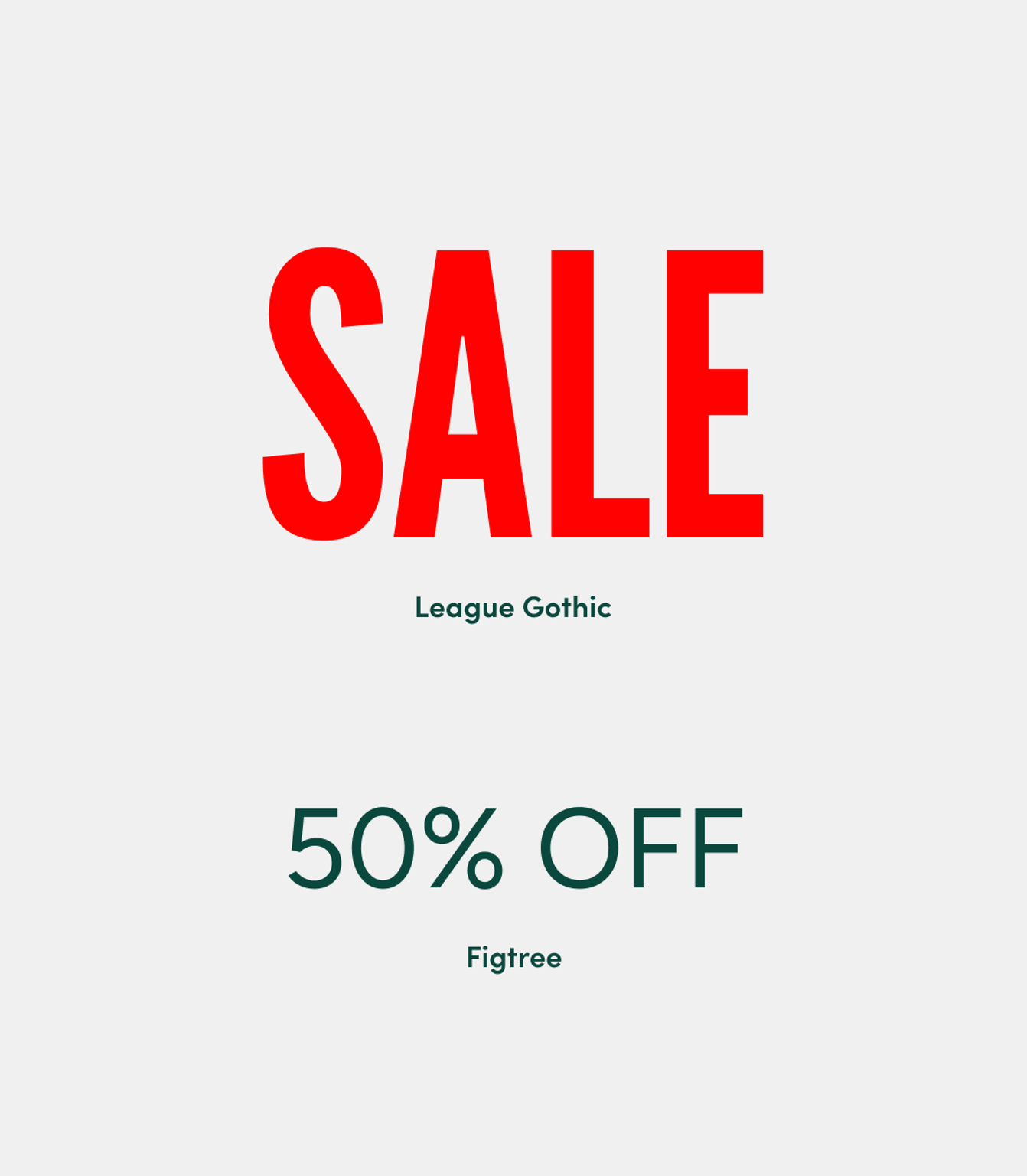
Confident typography
A bold, condensed font (League Gothic) was chosen to grab attention and convey transparency and confidence, paired with Figtree, a functional typeface for clarity and balance.

Affordability meets style
Finding the balance where affordability can express itself without losing its charm.

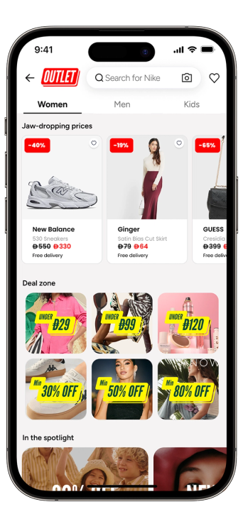
Design that demands attention.
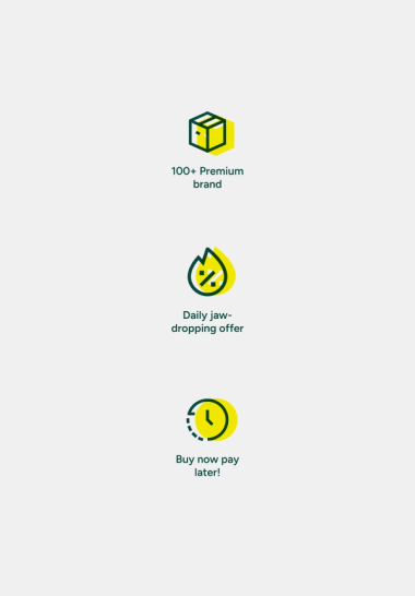
Icons on brand.
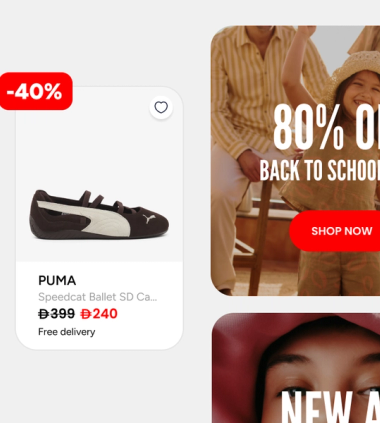
Round. Red. Right on point.
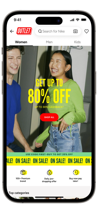

A new chapter: the outlet edition
Client
Namshi
Sector
Fashion
Services
Branding
Art direction
Delivered
2026